R Bootcamp Day 3: Tidying & Visualizing Data
Goals
By the end of this tutorial, you will:
- have a better understanding of tidyverse
verbs - understand the basics of graphing in ggplot2
- understand the basics of writing in RMarkdown (content in a separate document)
The best way to do this tutorial is to walk through it slowly, executing each line and trying to understand what it does. You can execute a single line by placing your cursor somewhere in that line and hitting CMD+enter on mac or CTRL+enter on PC.
Make sure you load the tidyverse first!
library(rio)
library(tidyverse)
## -- Attaching packages ------------------------------------------------------------------------------------------------------- tidyverse 1.3.0 --## v ggplot2 3.3.1 v purrr 0.3.4
## v tibble 3.0.1 v dplyr 0.8.5
## v tidyr 1.1.0 v stringr 1.4.0
## v readr 1.3.1 v forcats 0.5.0## -- Conflicts ---------------------------------------------------------------------------------------------------------- tidyverse_conflicts() --
## x dplyr::filter() masks stats::filter()
## x dplyr::lag() masks stats::lag()1. Data tidying with tidyr (Optional Content)
Much of this draws on the tidy data chapter from ‘R for Data Science’
The two key verbs in data tidying are spread and gather. Each of these verbs relies on a key-value pair that contains a key that indicates what the information describes and a value that contains the actual information.
“Password: 0123456789”" is a key value pair. 0123456789 is the value, and it is associated with the key Password.
The ps_data we’ve been using is already tidy. Now, we’ll look at some that are not! We’ll use some datasets that are built into the tidyverse package. Each dataset has the same values of four variables, country, year, population, and cases, but each dataset organizes them in different ways.
The “rules” for tidy data: + Each variable must have its own column. + Each observation must have it’s own row. + Each value must have its own cell.
?table1 #let's learn about the datset
table1 #this dataset is tidy!
1.1. Gathering Data
A common problem is a dataset where some column names are not names of variables, but values of a variable. Check out table4a.
table4a## # A tibble: 3 x 3
## country `1999` `2000`
## * <chr> <int> <int>
## 1 Afghanistan 745 2666
## 2 Brazil 37737 80488
## 3 China 212258 213766The column names 1999 and 2000 are not variables in our data, instead they represent values of the year variable, and each row represents two observations, not one. We need to gather these columns into a new pair of variables.
gather makes wide tables narrower and longer
There are three questions we must answer: > 1. Which columns do we want to gather? > A: > 2. What is the name of the variable whose values form the column names (the key)? > A: > 3. What is the name of the variable that is spread out over the cells (the value)? > A:
We’ll use these answers in the gather function:
table4a %>%
  gather(`1999`, `2000`, key = "year", value = "cases")
## # A tibble: 6 x 3
## country year cases
## <chr> <chr> <int>
## 1 Afghanistan 1999 745
## 2 Brazil 1999 37737
## 3 China 1999 212258
## 4 Afghanistan 2000 2666
## 5 Brazil 2000 80488
## 6 China 2000 213766Note that we had to wrap 1999 and 2000 in back ticks. This is because they violate column naming rules (remember, they shouldn’t start with numbers), and so we have to tell R more explicitly that these are in fact names with the back tick.
Exercise 1.1a.
table4bcontains information about thepopulationvariable. Let’s gather that table as well. Typetable4bto check it out before gathering. Your resulting table should have columns forcountry,year, andpopulation.
1.1.1 Gathering & Joining
Note that table4a contained our cases data while table4b contained our population data. Everything else is the same. Let’s join those two tables together using left_join, which we covered very briefly already (more about joining data frames here).
tidy4a <- table4a %>%
  gather(`1999`, `2000`, key = "year", value = "cases")

tidy4b <- table4b %>%
  gather(`1999`, `2000`, key = "year", value = "population")

left_join(tidy4a, tidy4b)
## Joining, by = c("country", "year")## # A tibble: 6 x 4
## country year cases population
## <chr> <chr> <int> <int>
## 1 Afghanistan 1999 745 19987071
## 2 Brazil 1999 37737 172006362
## 3 China 1999 212258 1272915272
## 4 Afghanistan 2000 2666 20595360
## 5 Brazil 2000 80488 174504898
## 6 China 2000 213766 1280428583Note that it matched on two variables - the *_join() functions automatically match based on every available ‘key’ column.
1.2 Spreading Data
In contrast to gathering, sometimes a single observation is scattered across multiple rows. Then, you’d want to use spread (which is the opposite of gather). Let’s look at table 2:
table2## # A tibble: 12 x 4
## country year type count
## <chr> <int> <chr> <int>
## 1 Afghanistan 1999 cases 745
## 2 Afghanistan 1999 population 19987071
## 3 Afghanistan 2000 cases 2666
## 4 Afghanistan 2000 population 20595360
## 5 Brazil 1999 cases 37737
## 6 Brazil 1999 population 172006362
## 7 Brazil 2000 cases 80488
## 8 Brazil 2000 population 174504898
## 9 China 1999 cases 212258
## 10 China 1999 population 1272915272
## 11 China 2000 cases 213766
## 12 China 2000 population 1280428583In table2, a single observation is a country in a year, but each observation is spread across two rows. We would want to spread() the type variable into columns.
spread makes long tables shorter and wider
Now, there are two questions we must answer: > 1. Which column contains the variable names (i.e., the key column)? > A: > 2. Which column contains the values (or the data from multiple variables)? > A:
We’ll use these answers in the spread function:
table2 %>%
  spread(key = type, value = count)
## # A tibble: 6 x 4
## country year cases population
## <chr> <int> <int> <int>
## 1 Afghanistan 1999 745 19987071
## 2 Afghanistan 2000 2666 20595360
## 3 Brazil 1999 37737 172006362
## 4 Brazil 2000 80488 174504898
## 5 China 1999 212258 1272915272
## 6 China 2000 213766 1280428583Exercise 1.2a.
Let’s play around with
ps_data. First import it (as ps_data). Then, make eachitema unique variable. Use spread to reformat the data so that there is a unique column for each item. The values in each of the fouritemcolumns should indicate whether or not the subject got that particular item right or wrong (i.e.,correctin ps_data). Hint: what is the key? What is the value? Do not save this as a new object.
1.3 Uniting and separating columns
In addition to making datasets longer (with gather()) and wider (with spread()), we can also unite() multiple columns into one, or separate() columns into multiple new columns.
1.3.1 separate()
You can separate() one column into multiple columns using the tidyr function separate(). It takes data as its first argument, then the column you want to separate (col =), then a vector of quoted names for the new columns (into =), and then what character to split values by (sep =).
Let’s use the starwars data and split each character’s name into first_name and last_name. Let’s start without setting the sep = argument to see what it does by default:
starwars %>%
  separate(col = name, into = c("first_name", "last_name"))
## Warning: Expected 2 pieces. Additional pieces discarded in 10 rows [7, 10, 16,
## 18, 29, 31, 34, 49, 60, 65].## Warning: Expected 2 pieces. Missing pieces filled with `NA` in 18 rows [13, 15,
## 19, 20, 23, 25, 26, 38, 39, 46, 58, 63, 64, 77, 78, 82, 83, 85].## # A tibble: 87 x 14
## first_name last_name height mass hair_color skin_color eye_color birth_year
## <chr> <chr> <int> <dbl> <chr> <chr> <chr> <dbl>
## 1 Luke Skywalker 172 77 blond fair blue 19
## 2 C 3PO 167 75 <NA> gold yellow 112
## 3 R2 D2 96 32 <NA> white, bl~ red 33
## 4 Darth Vader 202 136 none white yellow 41.9
## 5 Leia Organa 150 49 brown light brown 19
## 6 Owen Lars 178 120 brown, gr~ light blue 52
## 7 Beru Whitesun 165 75 brown light blue 47
## 8 R5 D4 97 32 <NA> white, red red NA
## 9 Biggs Darkligh~ 183 84 black light brown 24
## 10 Obi Wan 182 77 auburn, w~ fair blue-gray 57
## # ... with 77 more rows, and 6 more variables: gender <chr>, homeworld <chr>,
## # species <chr>, films <list>, vehicles <list>, starships <list>You might notice that it separated based on different characters, such as white space (luke & skywalker were separated) and by hyphens (C and 3PO were separated). By default, it separate looks for common separators (space, hyphen, underscore, periods, etc.) and uses all of them. This can be useful, but it has undesirable effects as you can see above. Let’s fix this by telling separate to use white space to separate first from last names using the sep = argument:
starwars_sep_names <- starwars %>%
  separate(name, c("first_name", "last_name"), sep = " ")
## Warning: Expected 2 pieces. Additional pieces discarded in 7 rows [7, 16, 18,
## 29, 34, 60, 65].## Warning: Expected 2 pieces. Missing pieces filled with `NA` in 24 rows [2, 3, 8,
## 13, 15, 19, 20, 22, 23, 25, 26, 38, 39, 46, 49, 58, 63, 64, 73, 77, ...].starwars_sep_names## # A tibble: 87 x 14
## first_name last_name height mass hair_color skin_color eye_color birth_year
## <chr> <chr> <int> <dbl> <chr> <chr> <chr> <dbl>
## 1 Luke Skywalker 172 77 blond fair blue 19
## 2 C-3PO <NA> 167 75 <NA> gold yellow 112
## 3 R2-D2 <NA> 96 32 <NA> white, bl~ red 33
## 4 Darth Vader 202 136 none white yellow 41.9
## 5 Leia Organa 150 49 brown light brown 19
## 6 Owen Lars 178 120 brown, gr~ light blue 52
## 7 Beru Whitesun 165 75 brown light blue 47
## 8 R5-D4 <NA> 97 32 <NA> white, red red NA
## 9 Biggs Darkligh~ 183 84 black light brown 24
## 10 Obi-Wan Kenobi 182 77 auburn, w~ fair blue-gray 57
## # ... with 77 more rows, and 6 more variables: gender <chr>, homeworld <chr>,
## # species <chr>, films <list>, vehicles <list>, starships <list>1.3.2 unite()
unite() is the complement of separate() and used to join the contents or values of different columns into one new column. It requires data as its first argument, then the unquoted name of the new column name, followed by unquoted names of columns you wish to unite. Let’s try to put the first and last names of starwars characters back together with unite():
starwars_sep_names %>%
  unite(col = name, first_name, last_name)
## # A tibble: 87 x 13
## name height mass hair_color skin_color eye_color birth_year gender
## <chr> <int> <dbl> <chr> <chr> <chr> <dbl> <chr>
## 1 Luke~ 172 77 blond fair blue 19 male
## 2 C-3P~ 167 75 <NA> gold yellow 112 <NA>
## 3 R2-D~ 96 32 <NA> white, bl~ red 33 <NA>
## 4 Dart~ 202 136 none white yellow 41.9 male
## 5 Leia~ 150 49 brown light brown 19 female
## 6 Owen~ 178 120 brown, gr~ light blue 52 male
## 7 Beru~ 165 75 brown light blue 47 female
## 8 R5-D~ 97 32 <NA> white, red red NA <NA>
## 9 Bigg~ 183 84 black light brown 24 male
## 10 Obi-~ 182 77 auburn, w~ fair blue-gray 57 male
## # ... with 77 more rows, and 5 more variables: homeworld <chr>, species <chr>,
## # films <list>, vehicles <list>, starships <list>Okay, so a couple of things went wrong:
It put an "_" between first and last names; we can easily change this to whitespace using
sep = " ".It merged in the NAs for characters without last names. This is more challenging and requires tools from other libraries.
Let’s go ahead and fix that! We’ll use another stringr function to remove the NAs form the names called str_remove_all(), which strips a pattern from a string
starwars_sep_names %>%
  unite(col = name, first_name, last_name, sep = " ") %>%
  mutate(name = str_remove_all(string = name, pattern = "NA")) # overwrite name with
## # A tibble: 87 x 13
## name height mass hair_color skin_color eye_color birth_year gender
## <chr> <int> <dbl> <chr> <chr> <chr> <dbl> <chr>
## 1 "Luk~ 172 77 blond fair blue 19 male
## 2 "C-3~ 167 75 <NA> gold yellow 112 <NA>
## 3 "R2-~ 96 32 <NA> white, bl~ red 33 <NA>
## 4 "Dar~ 202 136 none white yellow 41.9 male
## 5 "Lei~ 150 49 brown light brown 19 female
## 6 "Owe~ 178 120 brown, gr~ light blue 52 male
## 7 "Ber~ 165 75 brown light blue 47 female
## 8 "R5-~ 97 32 <NA> white, red red NA <NA>
## 9 "Big~ 183 84 black light brown 24 male
## 10 "Obi~ 182 77 auburn, w~ fair blue-gray 57 male
## # ... with 77 more rows, and 5 more variables: homeworld <chr>, species <chr>,
## # films <list>, vehicles <list>, starships <list> # name with NAs removed2. Graphing in ggplot2
Now let’s talk about one of the best parts of the tidyverse and R more generally: ggplot2.
ggplot2 is the grammar of graphics, and is the tidyverse package for creating plots. Even with just a few of its commands, it can make beautiful, publication-ready plots. Its more advanced features add even more versatility. And, people make companion packages for it to do even more (e.g., ggpubr to add statistics to your plot).
Note, what we’ll cover today is just the beginning! There are entire books on graphing in ggplot2!.
Last note, I’m borrowing heavily from this guide that Jonny Saunders put together.
For this section we’re going to use another dataset that is built into R. It is called iris and it is the canonical ggplpot2 dataset. Let’s start by making a scatter plot of the relationship between Sepal.Length and Petal.Length.
?iris # first, let's learn about the dataset
head(iris)
When creating a plot in ggplot2, the first thing you have to do is call the ggplot() function. It takes data as its first argument. Let’s start there:
ggplot(data = iris)
And, nothing happened. To understand why, let’s back up to the philosophy of ggplot:
2.1 Philosophy of ggplot
What is a statistical graphic? According to Wickham, we can think of statistical graphics as:
- Mappings from data to aesthetic attributes (color, shape, size)
- Of geometric objects (points, lines, bars)
- On a particular coordinate system (or scale)
- Sometimes after a statistical transformation
In ggplot, that combination of things forms a layer. The terminology in ggplot is
- aes - aesthetic mappings
- geom - geometric objects
- scale - …scales
- stat - statistical transformations
Reordered, the flow of information in ggplot2 is:
datais attached to the ggplot call,- mapped by
aes(), and - transformed by
statbefore being passed to a geom(),- which is placed, sized, and colored according to its relevant
scale - then ta-da! rendered plot.
We already did step 1 above, by providing our iris dataset to ggplot(). Let’s move onto aesthetic mapping.
2.1 Aesthetic Mapping
The basic idea is that we want to take our data and map it onto physical space using geometric objects or geoms. For ggplot to place a geom, it needs to know how the data map onto the aesthetics of the graph. Each geom() function in ggplot takes a mapping argument. Let’s start with a basic geom, geom_histogram().
2.1.1 Mapping with geoms
We’re going to call ggplot()again, and this time add thegeom_histogram()*layer*, telling it to map the variableSepal.Length` to the x axis aesthetic:
ggplot(data = iris) + # attach data
    geom_histogram(mapping = aes(x = Sepal.Length)) # add geom w/ aesthetic map
## `stat_bin()` using `bins = 30`. Pick better value with `binwidth`.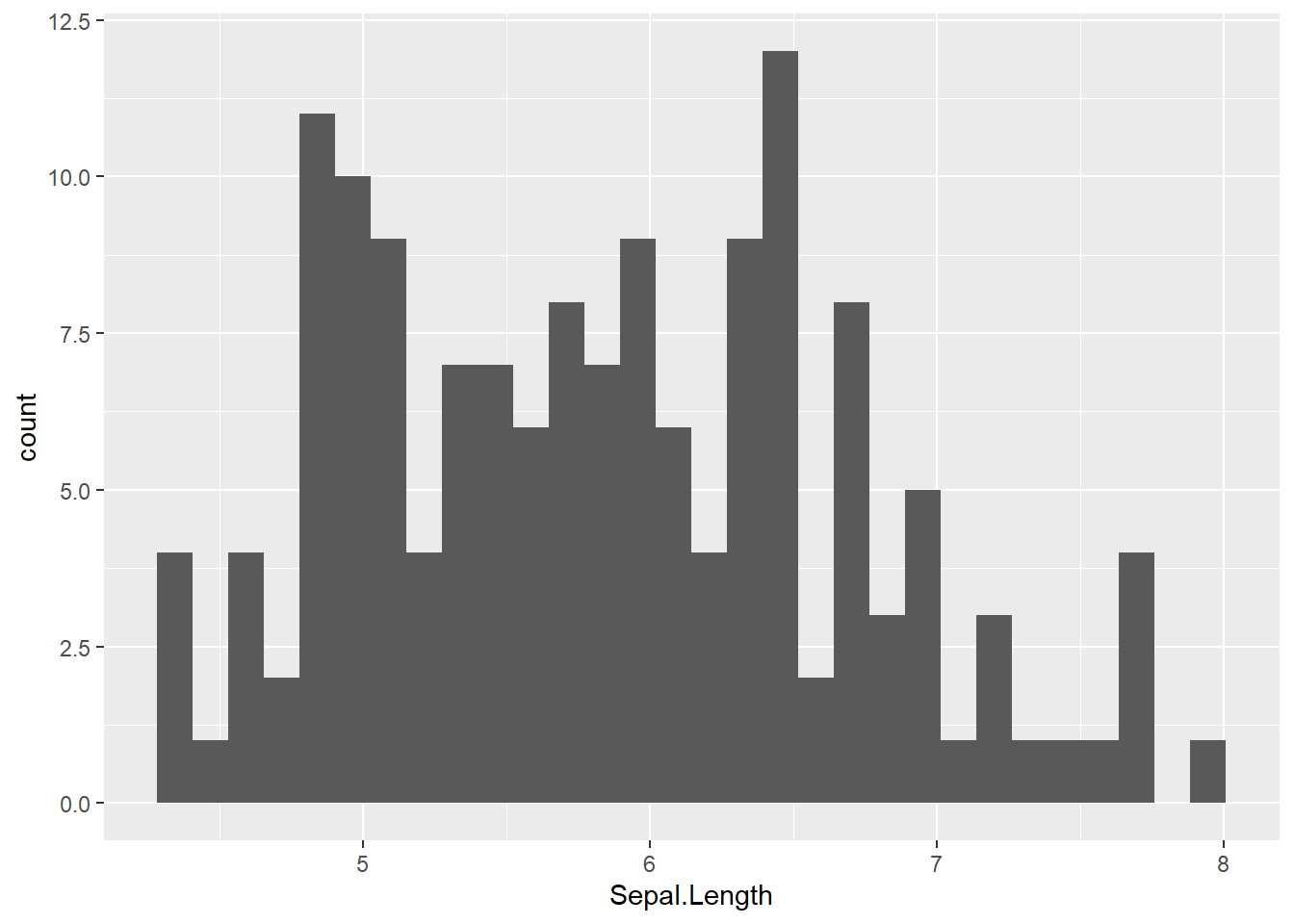
geom_histogram() only requires one aesthetic mapping, the x aesthetic, which tells it what variable it should map to the x axis. You can add additional arguments to the geom(). For example, we could change the number of bins:
ggplot(data = iris) + # attach data
    geom_histogram(mapping = aes(x = Sepal.Length), # add geom to aesthetic mapping
                   bins = 9) # change bins to 9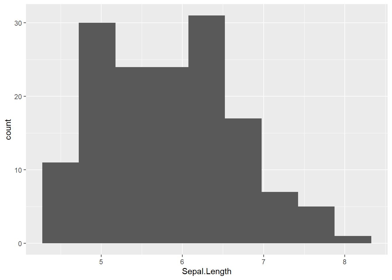
Or make them a different color:
ggplot(data = iris) + # attach data
    geom_histogram(mapping = aes(x = Sepal.Length),
                   color = "red") # fill, bc hist bars are 2-d
## `stat_bin()` using `bins = 30`. Pick better value with `binwidth`.
Let’s look at something just a tiny but more complicated: we’ll add a layer of points to our plot (creating a scatterplot) using geom_point(). geom_point() is another geom function, each of which adds a different type of layer to a plot. Let’s see what happens if we just give it an x variable to map:
ggplot(data = iris) + # attach data
    geom_point(mapping = aes(x = Sepal.Length)) # add geom w/ aesthetic map
We get an error, telling us that geom_point requires the y aesthetic to be defined. This makes sense - we need an x and y axis to define where points belong on a scatter plot. Or make them a different color. We can change the color of 2-d objects with the fill aesthetic:
ggplot(data = iris) + # attach data
    geom_histogram(mapping = aes(x = Sepal.Length),
                   fill = "red") # fill, bc hist bars are 2-d
## `stat_bin()` using `bins = 30`. Pick better value with `binwidth`.
Let’s look at something just a tiny but more complicated: we’ll add a layer of points to our plot (creating a scatterplot) using geom_point(). geom_point() is another geom function, each of which adds a different type of layer to a plot. Let’s see what happens if we just give it an x variable to map:
ggplot(data = iris) + # attach data
    geom_point(mapping = aes(x = Sepal.Length)) # add geom w/ aesthetic map
We get an error, telling us that geom_point requires the y aesthetic to be defined. This makes sense - we need an x and y axis to define where points belong on a scatter plot. Let’s add Petal.Length as the y axis:
ggplot(data = iris) + # attach data
    geom_point(mapping = aes(x = Sepal.Length, y = Petal.Length)) # add geom w/ aesthetic map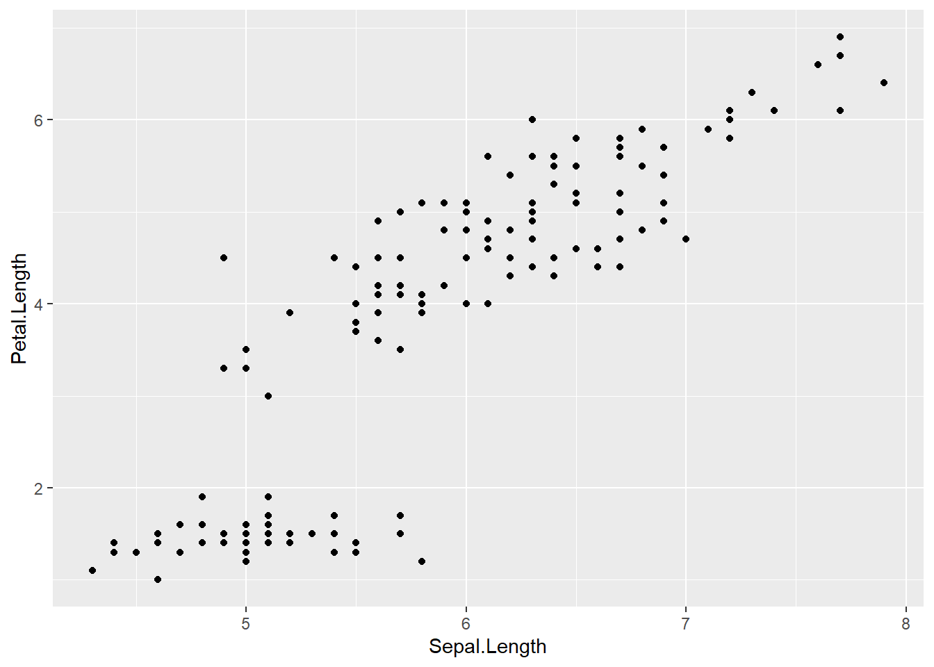
Let’s find out if the relationship between Sepal.Length & Petal.Length relates to the Species of iris. To visualize this, we are going to map Species to an aesthetic too. We’ll use the color aesthetic, which is like fill but for 1-d objects (e.g., points, lines, etc.).
ggplot(data = iris) + # attach data
  geom_point(mapping = aes(x = Sepal.Length, # geom w/ aesthetic mapping
                           y = Petal.Length,
                           color = Species)) # color including in aes()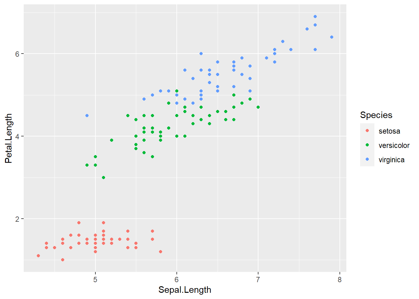
Notice that we included color in our aesthetic mapping call (mapping = aes()) here, but not when we filled our histogram with the color red. This is the difference between aesthetically mapping data and just setting an aesthetic to some value (e.g., “red”).
This is a fairly common mistake, so let’s take a look at what happens if we tell it to make our points red but accidentally include that in the aes() call:
ggplot(data = iris) + # attach data
  geom_point(mapping = aes(x = Sepal.Length, # geom w/ aesthetic mapping
                           y = Petal.Length,
                           color = "red")) # color including in aes()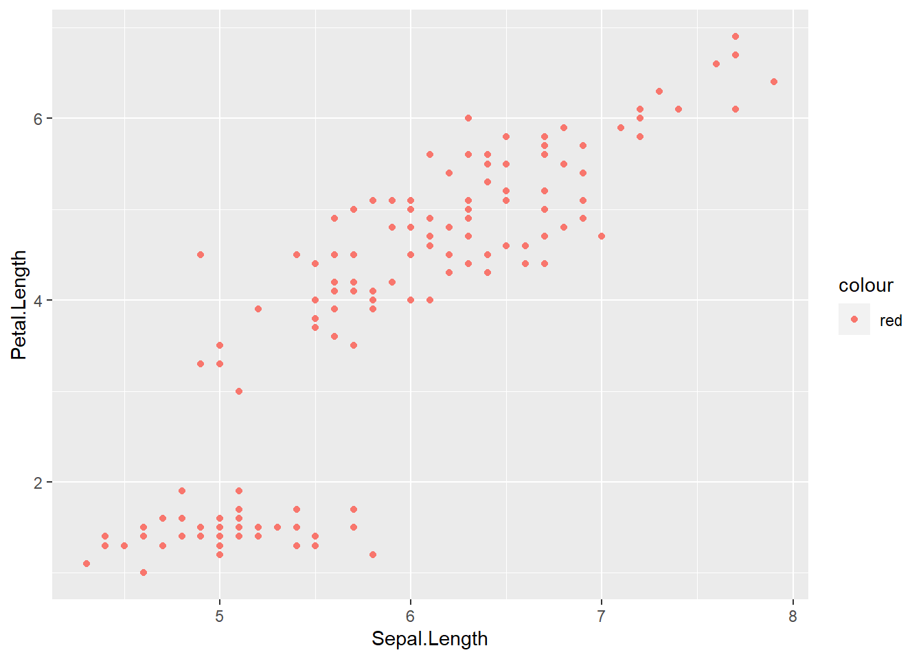
Exercise 2.1a.
Options for aesthetics include color, shape, size, and alpha. Create a scatter plot to visualize the relationship between
Sepal.WidthandPetal.Width. Add an aesthetic to visualize the effect ofSpecies. Choose any aesthetic you’d like or play around with a few. What do they do? How might you use more than one aesthetic?
We could also make separate graphs for each Species using facet_wrap(). By passing a formula to facet_wrap.
Here’s how:
ggplot(data = iris) +
  geom_point(mapping = aes(x = Sepal.Length, y = Petal.Length)) +
  facet_wrap(~ Species)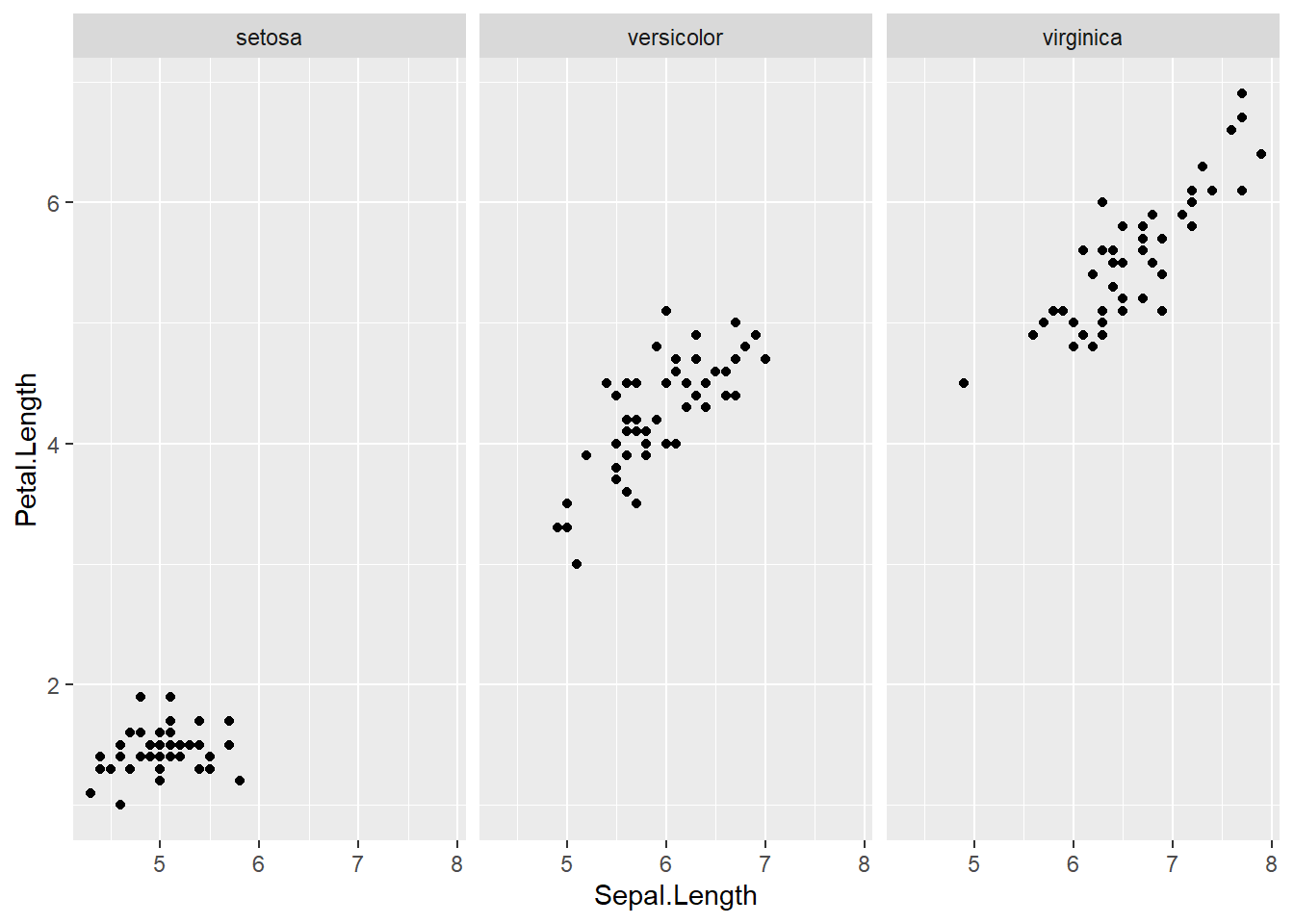
One thing we often want to do is add a line over our scatterplot to describe the correlation between variables. We can do this by adding another geom layer to our plot.
Let’s make the same plot, using the geom_smooth() which fits a smoothed line to the data.
ggplot(data = iris) +
  geom_point(mapping = aes(x = Sepal.Length, y = Petal.Length, color = Species)) +
  geom_smooth(mapping = aes(x = Sepal.Length, y = Petal.Length), color = "black")
## `geom_smooth()` using method = 'loess' and formula 'y ~ x' Note that loess is the default function for geom_smooth(); learn more here.
You can change that by setting the method argument in geom_smooth(), Let’s change it to our old friend linear regression or “lm”:
ggplot(data = iris) +
  geom_point(aes(x = Sepal.Length, y = Petal.Length, color = Species)) +
  geom_smooth(aes(x = Sepal.Length, y = Petal.Length),
              color = "black",
              method = "lm")
## `geom_smooth()` using formula 'y ~ x'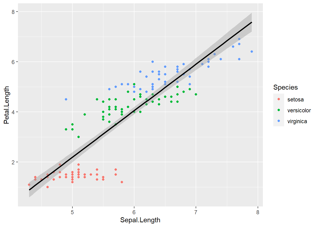
2.1.2 Global Aesthetic Mapping
That looks pretty good, but this code is getting inefficient, because we’re specifying the x and y axis for each geom_* call. Instead, we can use global aesthetic mappings, which are specified in the ggplot() call. Global mappings are inherited by each layer unless they’re overwritten.
Let’s re-make our plot using global aesthetic mapping:
ggplot(data = iris, aes(x = Sepal.Length, y = Petal.Length)) +
  geom_point(aes(color = Species)) +
  geom_smooth(color = "black", method = "lm")
## `geom_smooth()` using formula 'y ~ x'
You might be wondering, what do we put in global aesthetic mapping and what do we put in the aesthetic mapping of specific geoms? Basically, you want to put anything in the global mapping that you want every layer to inherit or at least the majority of them. In the above, I defined x and y globally, because I want those the same in every geom. I didn’t with color, since I wanted a single black line for the smooth line. Let’s take a look at it with color in the global aesthetic:
ggplot(data = iris, aes(x = Sepal.Length, y = Petal.Length, color = Species)) +
  geom_point() +
  geom_smooth()
## `geom_smooth()` using method = 'loess' and formula 'y ~ x'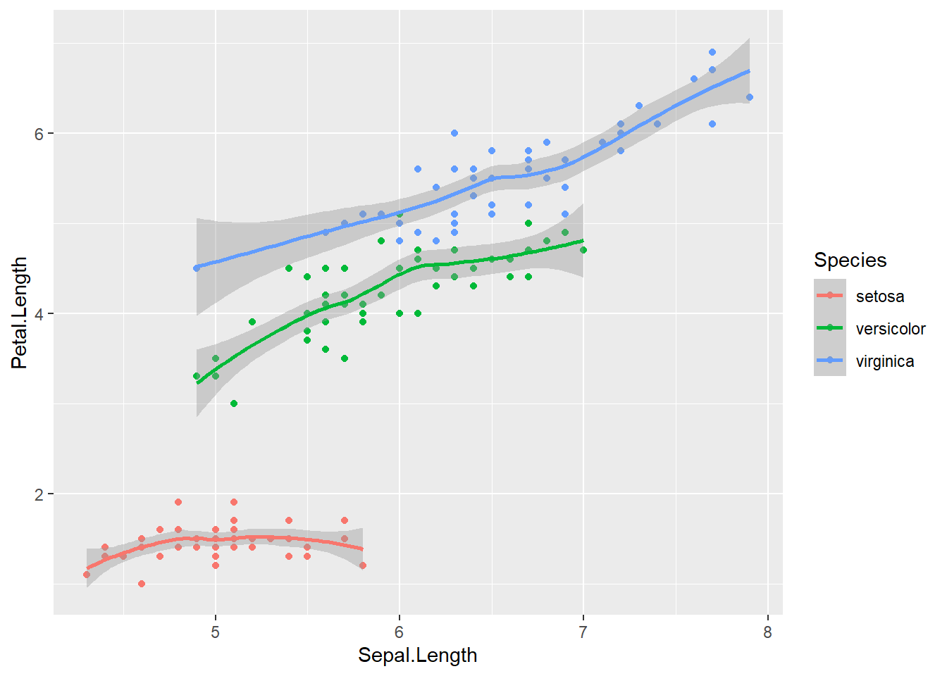
As you can see, global aesthetic mapping gets inherited by every layer. We can override this by providing a different aesthetic mapping in the geom() call
ggplot(data = iris, aes(x = Sepal.Length, y = Petal.Length, color = Species)) +
  geom_point() +
  geom_smooth(color = "black")
## `geom_smooth()` using method = 'loess' and formula 'y ~ x'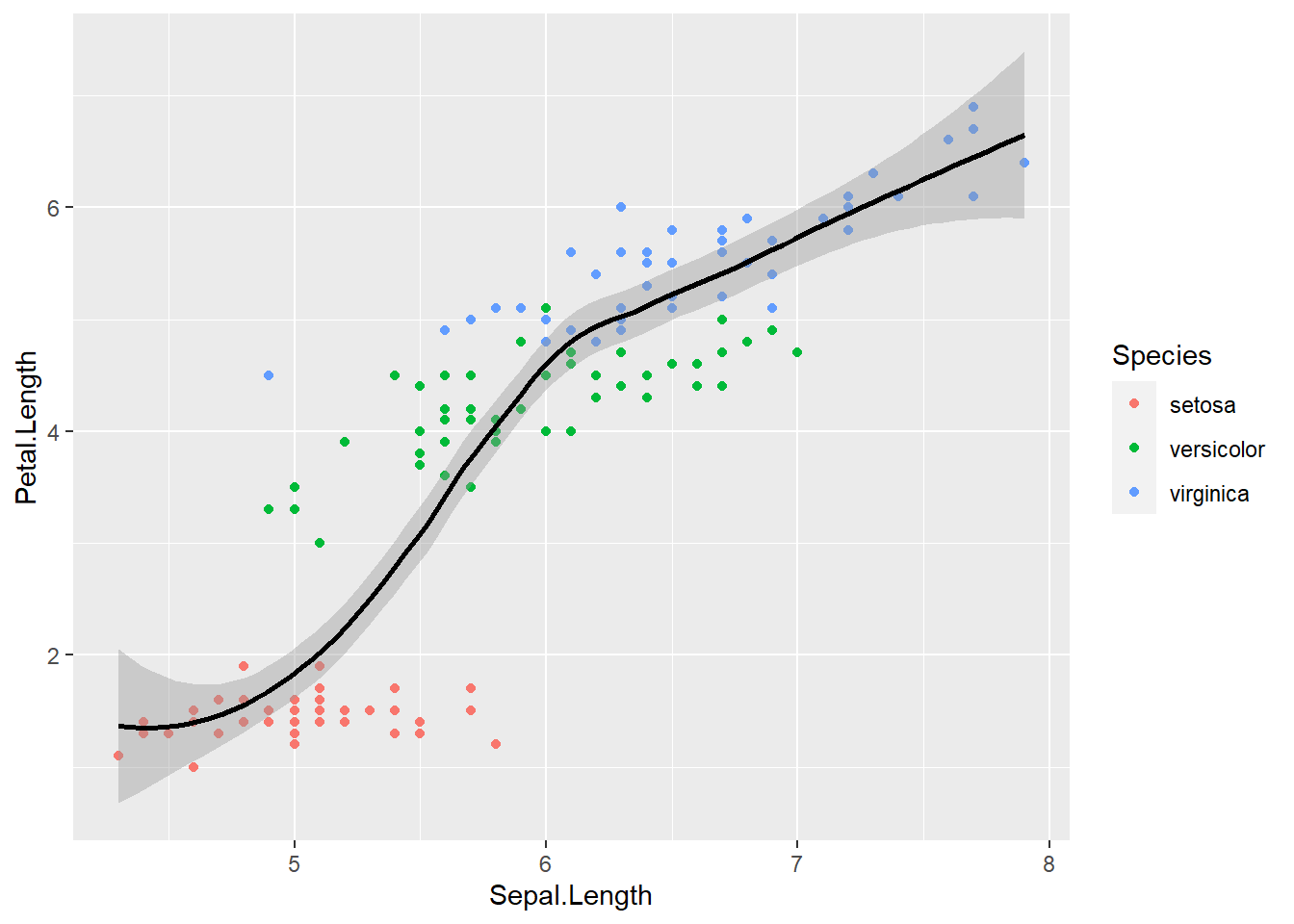
And, you can sort of mix and match. For example, if you want a smooth line for each species and a general one, you can just make 2 geom_smooth() calls, and provide different aesthetic mappings
ggplot(data = iris, aes(x = Sepal.Length, y = Petal.Length, color = Species)) +
  geom_point() + # inhereit global
  geom_smooth() + # inherit global
  geom_smooth(color = "black") # change color to constant
## `geom_smooth()` using method = 'loess' and formula 'y ~ x'
## `geom_smooth()` using method = 'loess' and formula 'y ~ x'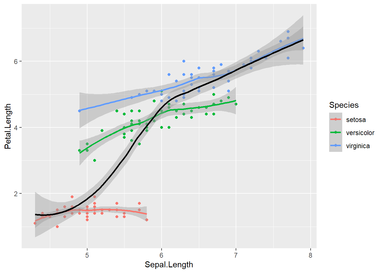
There are lots of other geoms we can map data onto. geom_bar() is another very common one to display group differences. Let’s take a look at each species average petal length:
ggplot(data = iris, aes(x = Species, y = Petal.Length)) +
  geom_bar() # inhereit global
Hmmm, stat_count() must not be used with y aesthetic. What does this mean? Let’s take a look at the help documentation:
?geom_barThe help documentation says that the default is stat = "count", which counts the number of classes. We want stat = "identity", which leaves the data as is. Let’s give it another go:
ggplot(data = iris, aes(x = Species, y = Petal.Length)) +
  geom_bar(stat = "identity") # inhereit global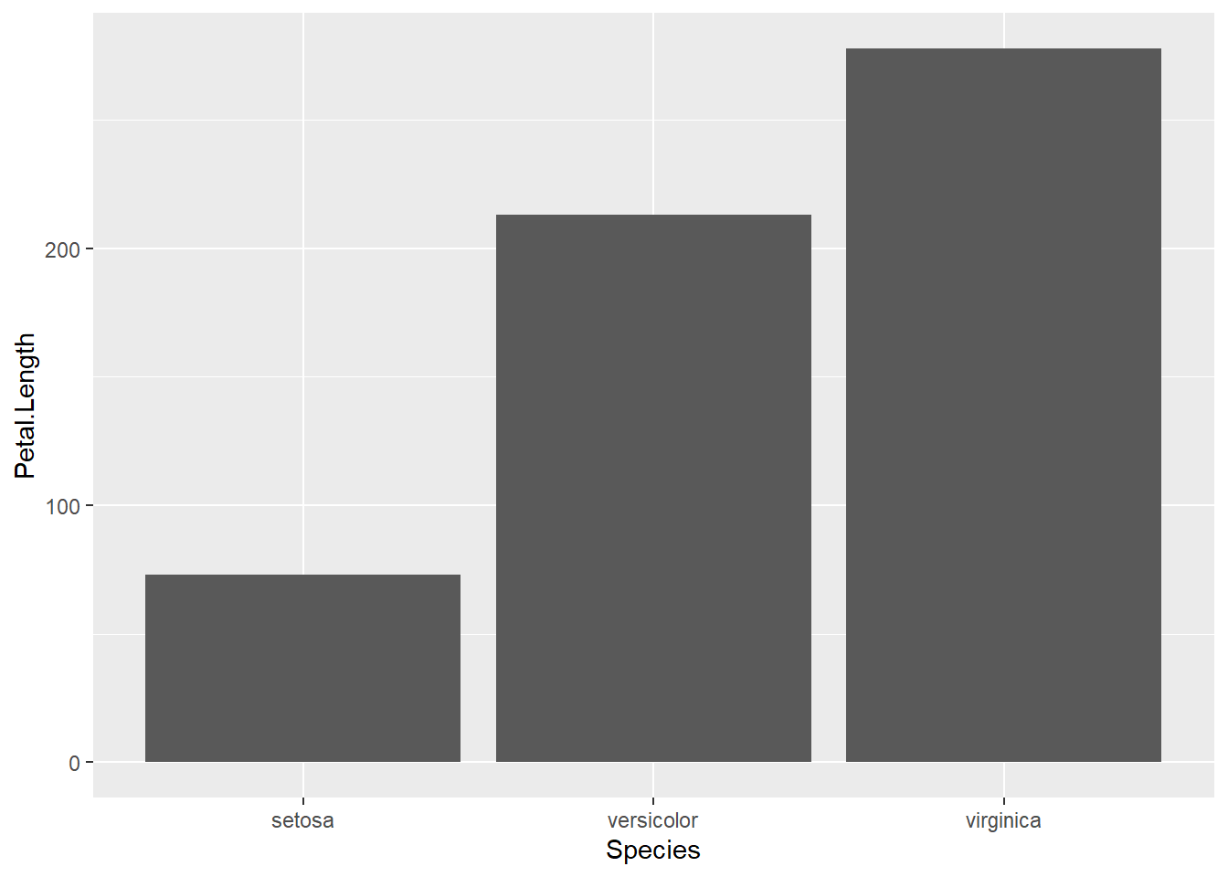
And we could add a little color if we wanted:
ggplot(data = iris, aes(x = Species, y = Petal.Length, fill = Species)) +
  geom_bar(stat = "identity") # inhereit global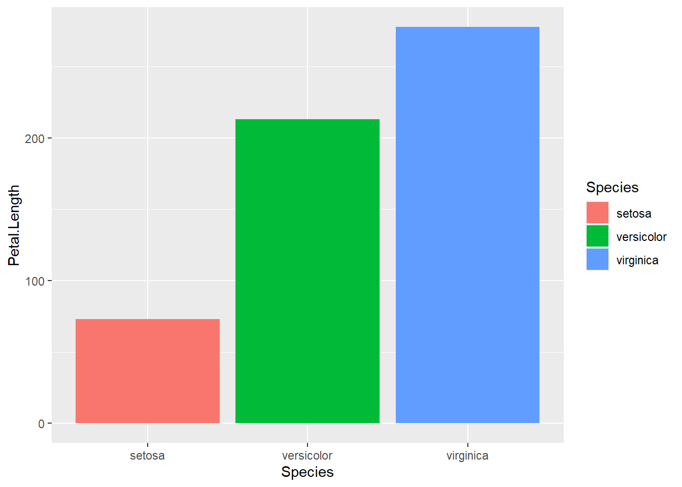
Exercise 2.1b
I want you to re-create this plot:

2.2 geom-level Data
So far, we’ve seen that aesthetic mappings can be local to a geom or global and inherited by all geoms by default. In ggplot2, data is the same way. We can have data defined globally in the ggplot() call, which is what we’ve been doing so far. Or, we can have it defined within a geom.
For example, if we’re interested in group differences, we may want to include group-level (summary) data and individual data in the same plot. Let’s make a plot of human vs. droid mass, where the average of each group is a bar and individual characters’ data is shown as individual points.
# get summary data
starwars_means <- starwars %>%
  filter(species == "Human" | species == "Droid") %>%
  group_by(species) %>%
  summarize(mean_mass = mean(mass, na.rm = TRUE))

# uisng the summary data as the global data
ggplot(starwars_means, aes(x = species, y = mean_mass, fill = species)) +
  geom_bar(stat = "identity") +
  geom_point(data = filter(starwars, species == "Human" |
                             species == "Droid"), # using individual
                                                  # data as geom specific data
                           aes(x = species, y = mass))
## Warning: Removed 14 rows containing missing values (geom_point).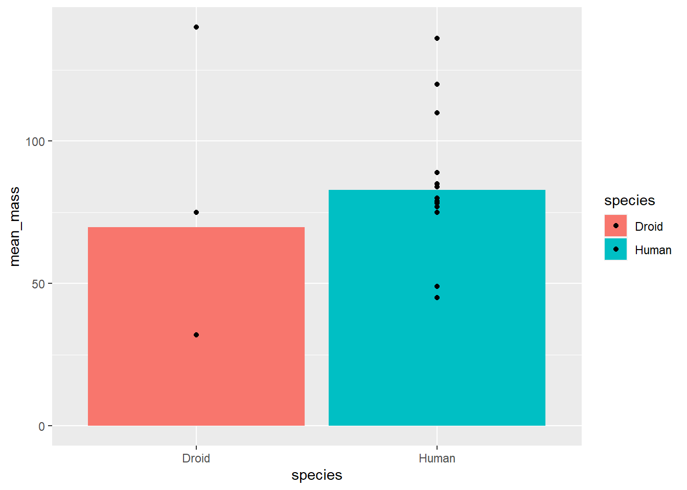
This is pretty good, but it’s a little hard to read because points might be overlapping. We have a few options to change the aesthetics to make this plot easier to read.
First, we could artificially add noise to the points so that they don’t overlap using the jitter option in the position aesthetic. There are multiple ways to do this, but one is to provide the function position_jitter() to the position argument:
# uisng the summary data as the global data
ggplot(starwars_means, aes(x = species, y = mean_mass, fill = species)) +
  geom_bar(stat = "identity") +
  geom_point(data = filter(starwars, species == "Human" |
                             species == "Droid"), # using individual
                                                  # data as geom specific data
                           aes(x = species, y = mass),
             position = position_jitter())
## Warning: Removed 14 rows containing missing values (geom_point).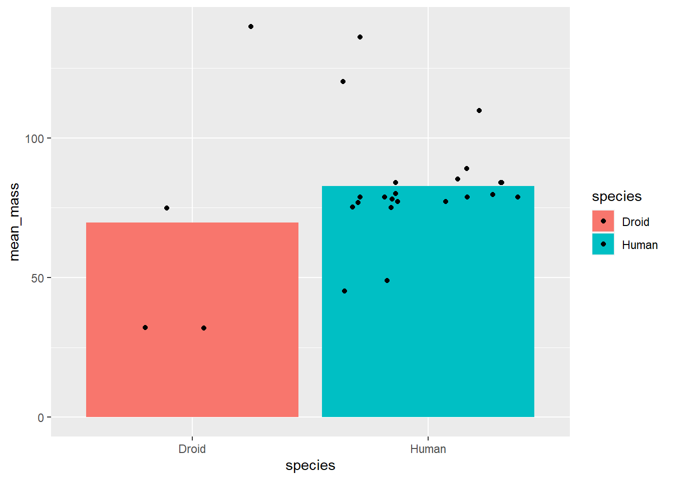
Then, we can add argumnts to position_jitter() to customize it more. For example, I just want to points to jitter on the x-axis and not the y-axis. That way, they don’t overlap but they still retain their true value of mass. We can do this by setting the height argument to 0 within position_jitter(). While we’re at it, let’s constrain things a bit more by setting the width argument to a smaller value:
# uisng the summary data as the global data
ggplot(starwars_means, aes(x = species, y = mean_mass, fill = species)) +
  geom_bar(stat = "identity") +
  geom_point(data = filter(starwars, species == "Human" |
                             species == "Droid"), # using individual
                                                  # data as geom specific data
                           aes(x = species, y = mass),
             position = position_jitter(height = 0, width = .1))
## Warning: Removed 14 rows containing missing values (geom_point).
A second option I want to draw your attention to is the alpha aesthetic, which controls the shading of a geom. It defaults to 1, which is full saturation, but you can map it onto data with aesthetic mapping or set it to a constant.
I often do this when I want to keep the position of the data (i.e., not jitter), but want to more easily see overlapping points. To change it, we just set alpha to some number betweeen 0 and 1.
# uisng the summary data as the global data
ggplot(starwars_means, aes(x = species, y = mean_mass, fill = species)) +
  geom_bar(stat = "identity") +
  geom_point(data = filter(starwars, species == "Human" |
                             species == "Droid"), # using individual
                                                  # data as geom specific data
                           aes(x = species, y = mass),
             alpha = .3)
## Warning: Removed 14 rows containing missing values (geom_point).
Exercise 2.2a
Use what we’ve learned so far to plot the average age of kids in each condition of
ps_dataand include each kid’s age (hint: you’ll need to create 2 new datasets; one with averages per condition and one with just individual kids’). Try to make sure you can see each point using either position or alpha.
2.3 Labels & Themes
2.3.1 Labels
The plots we just made are pretty close to what we might include in a publication or talk. But, we might want a little more control over things. For example, we might want to change mean_age on the Y-axis to a prettier label (e.g., Mean Age). We also might want to add a title. We can do both with the labs argument.
# Import ps_data (uneccesary if you completed exercise 1.2a)
ps_data <- import("pragmatic_scales_data.csv")
# Mean Data:
ps_mean_age <- ps_data %>%
  group_by(condition) %>%
  summarize(mean_age = mean(age, na.rm = TRUE))

# distinct kids data
ps_distinct_age <- ps_data %>%
  distinct(subid, condition, age)

ggplot(ps_mean_age, aes(x = condition, y = mean_age, fill = condition)) +
  geom_bar(stat = "identity") +
  geom_point(data = ps_distinct_age, aes(x = condition, y = age),
             position = position_jitter(height = 0, width = .2)) +
  # change labels with labs:
  labs(title = "Age by Condition:", # add a title with title
       subtitle = "Group- and Kid-level age", # you can even add a subtitle
       x = "Condition",
       y = "Mean Age")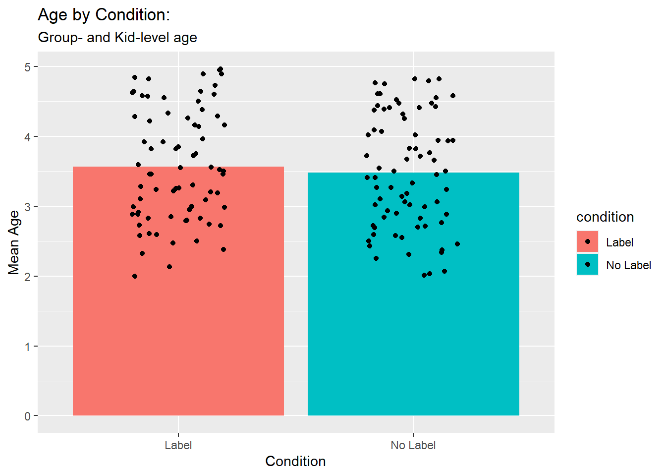
2.3.2 Themes
Beautiful! We could also change the way things look by chaging the theme().
2.3.2.1 Customizing theme()
You can set arguments within theme() manually. For example, let’s change the axis.text to be 30 pt size. To do this, we set the axis.text argument to a size by setting the size argument of the element_text() function.
ggplot(ps_mean_age, aes(x = condition, y = mean_age, fill = condition)) +
  geom_bar(stat = "identity") +
  geom_point(data = ps_distinct_age, aes(x = condition, y = age),
             position = position_jitter(height = 0, width = .2)) +
  # change labels with labs:
  labs(title = "Age by Condition:", # add a title with title
       subtitle = "Group- and Kid-level age", # you can even add a subtitle
       x = "Condition",
       y = "Mean Age") +
  theme(axis.text = # axis.title argument of theme
          element_text(size = 30)) # size element of element_text
element_blank() can be used to remove basically any element. For example, let’s get rid of all of our axis labels:
ggplot(ps_mean_age, aes(x = condition, y = mean_age, fill = condition)) +
  geom_bar(stat = "identity") +
  geom_point(data = ps_distinct_age, aes(x = condition, y = age),
             position = position_jitter(height = 0, width = .2)) +
  # change labels with labs:
  labs(title = "Age by Condition:", # add a title with title
       subtitle = "Group- and Kid-level age", # you can even add a subtitle
       x = "Condition",
       y = "Mean Age") +
  theme(axis.text = # axis.title argument of theme
          element_blank()) # set to element_blank
You can do so much more with customizing themes. And, you can save your theme and use it for other plots too! Let’s save out crazy axis label theme and use it for a couple of plots.
To save a theme, you just assign it to a name like any R object. Let’s do that now:
label_madness_theme <- theme(axis.text = # axis.title argument of theme
          element_text(size = 30)) # size element of element_text
And then we just add our custom theme as a layer of our plot:
ggplot(ps_data, aes(x = item, y = correct, fill = item)) +
  geom_bar(stat = "identity") +
  facet_wrap(~condition) +
  label_madness_theme # add in the custom theme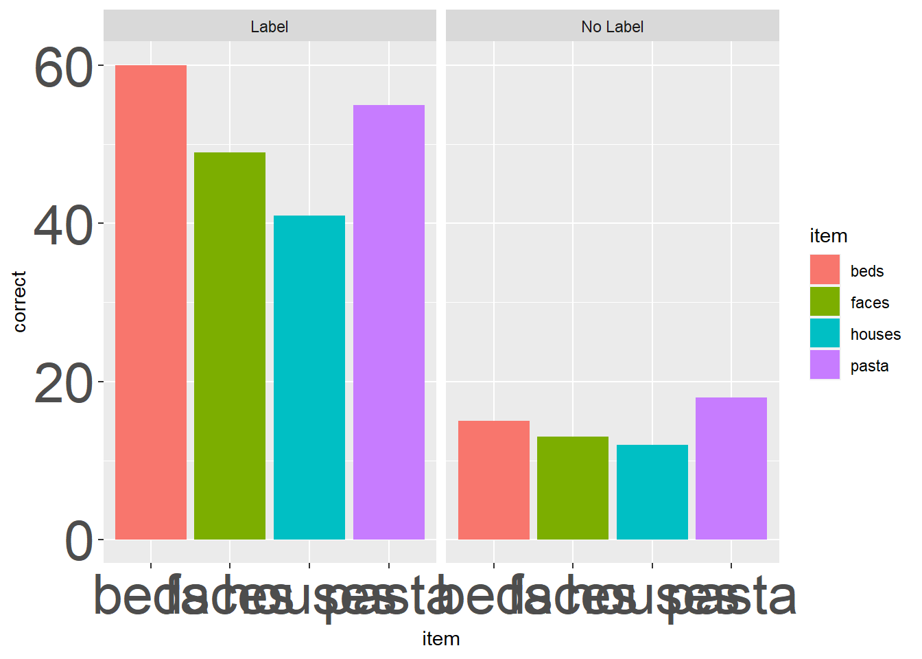
Ooof, that looks wild. This example is a little silly, buy I use custom themes often to make the same plot scale well for a manuscript (where smaller text & geoms usually work) and PPTs (where larger text & geoms are usually better). Here’s an example from my own work:
# Custom theme for the reputation manuscript
theme_rep_manuscript <-  theme(panel.background = element_blank(),
                         panel.grid.major.x = element_line(size=.4, color="gray90"))+
  theme(axis.line.x = element_line(color="black", size = 1),
        axis.line.y = element_line(color="black", size = 1))+
  theme(axis.title = element_text(size = rel(1), color="black"),
        axis.text = element_text(size = rel(1), color="black"))+
  theme(plot.title= element_text(size=rel(1), hjust = .5))

# Custom theme for the reputation manuscript
theme_rep_ppt <-  theme(panel.background = element_blank(),
                         panel.grid.major.x = element_line(size=1, color="gray90"))+
  theme(axis.line.x = element_line(color="black", size = 2),
        axis.line.y = element_line(color="black", size = 2))+
  theme(axis.title = element_text(size = rel(2), color="black"),
        axis.text = element_text(size = rel(2), color="black"))+
  theme(plot.title= element_text(size=rel(2), hjust = .5))
ggplot(ps_data, aes(x = item, y = correct, fill = item)) +
geom_bar(stat = "identity") +
facet_wrap(~condition) +
theme_rep_manuscript 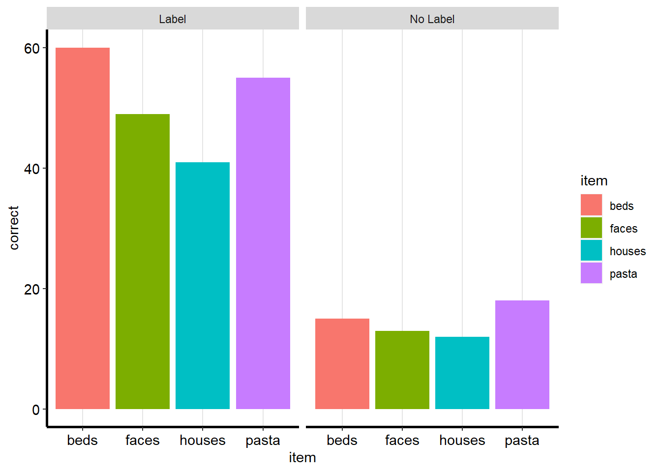
ggplot(ps_data, aes(x = item, y = correct, fill = item)) +
  geom_bar(stat = "identity") +
  facet_wrap(~condition) +
  theme_rep_ppt +
  coord_flip() # flip the coordinates to accomodate size of text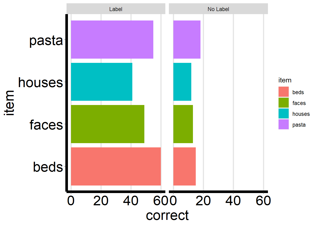
2.3.2.2 Using built-in themes
ggplot2 also comes with a number of themes you can use. This can be a great thing to explore if you’re not comfortable customizing your theme yourself quite yet, but do want to change the way your plots look.
All of the themes start with theme_, so you can see what’s available by typing that in and looking at the autocomplete options:
?theme_Let’s change the theme of the correct by condition & item plot to theme_minimal(). To do this, we just add it as a layer just like a custom theme. The only difference is that it must be followed by (), since it’s technically a function:
ggplot(ps_data, aes(x = item, y = correct, fill = item)) +
  geom_bar(stat = "identity") +
  facet_wrap(~condition) +
  theme_minimal()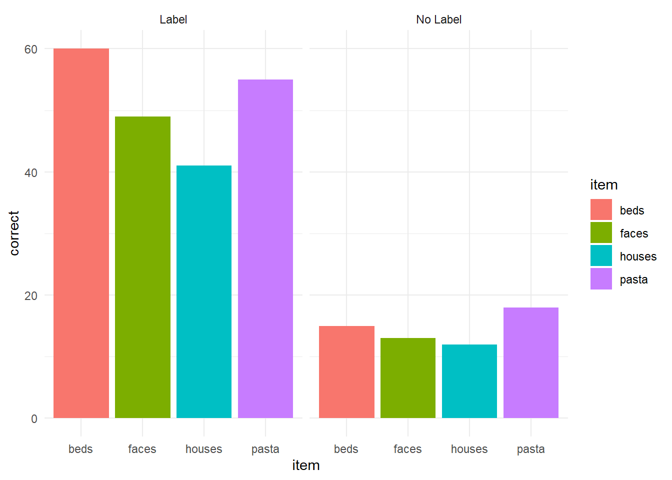
Or we could just as easily change it to theme_linedraw():
ggplot(ps_data, aes(x = item, y = correct, fill = item)) +
  geom_bar(stat = "identity") +
  facet_wrap(~condition) +
  theme_linedraw()
Exercise 2.3a
Now I want you to explore the themes in ggplot2. Recreate whichever plot from today you want - or try to make a new one if you like - and try out different themes and find a favorite.
2.4 Changing Scales
The last thing we’ll touch on in ggplot are scales. Scale set the parameters for how geoms are sized, colored, place, etc. Let’s take a look at one more dataset, the diamonds dataset:
{ eval = FALSE} ?diamonds
As we see, it has 50,000 cases. We’re going to create a new diamonds that’s a little smaller to keep things running quickly using the sample_n function:
diamonds <- diamonds %>%
  sample_n(1000)
Let’s take a look at the relationship between a diamonds’ carat and its price. But first, let’s see how each is distributed:
ggplot(diamonds, aes(x = carat)) +
  geom_histogram()
## `stat_bin()` using `bins = 30`. Pick better value with `binwidth`.
ggplot(diamonds, aes(x = price)) +
  geom_histogram()
## `stat_bin()` using `bins = 30`. Pick better value with `binwidth`.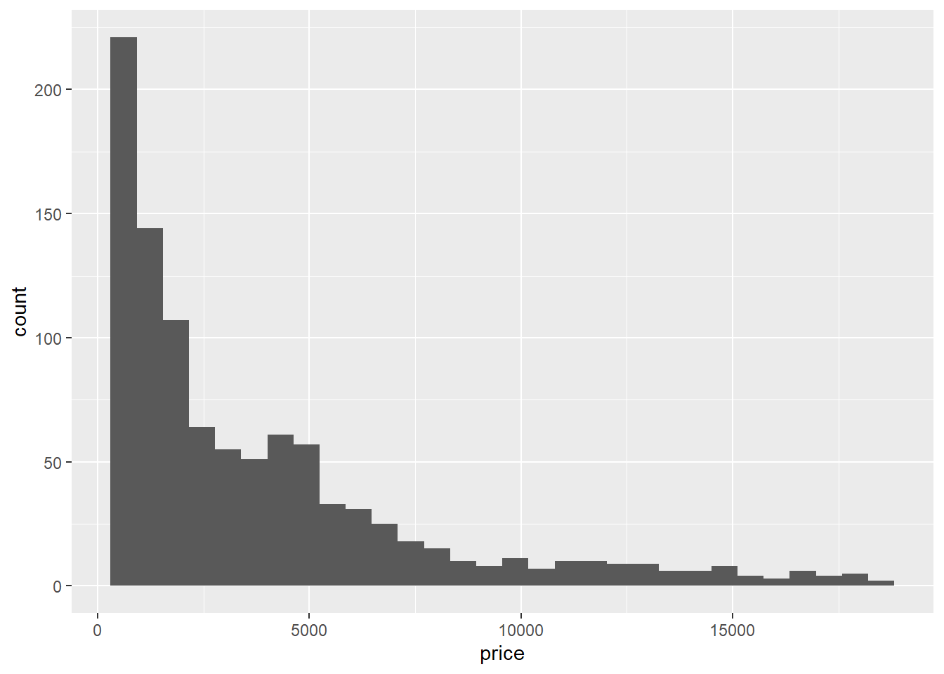
Looks like both variables are positively (right-) skewed. One solution is to log transform them, and we can do that pretty easily for our plot by changing the scale.
ggplot2 has a number of scale options for all of its aesthetics. We’ll re-scale x and y using scale_x_log10 and scale_y_log10:
ggplot(diamonds, aes(x = carat, y = price)) +
  geom_point() +
  theme_minimal() +
  scale_x_log10() +
  scale_y_log10()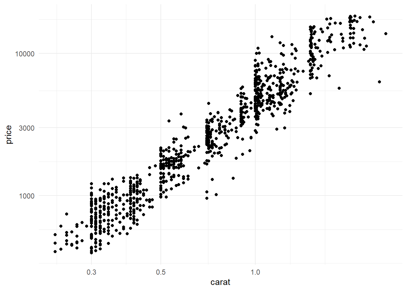
You can also change the scale of other aesthetics too. For example, let’s color points by diamonds’ cut:
ggplot(diamonds, aes(x = carat, y = price, color = cut)) +
  geom_point(alpha = .5) + # changing alpha bc of overlap
  theme_minimal() +
  scale_x_log10() +
  scale_y_log10()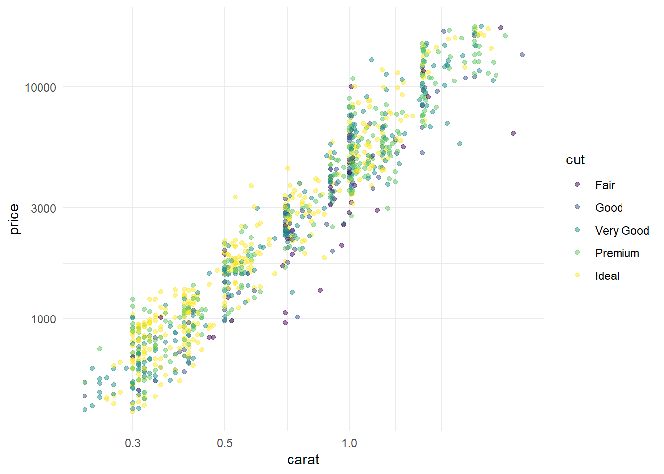
And then we could change that using scale_color_brewer() and setting the pallete to something else. We can see its options by checking out the help documentation:
?scale_color_brewerLet’s set it to set1:
ggplot(diamonds, aes(x = carat, y = price, color = cut)) +
  geom_point(alpha = .5) + # changing alpha bc of overlap
  theme_minimal() +
  scale_x_log10() +
  scale_y_log10() +
  scale_color_brewer(palette="Set1")
Or we could change it to another palette:
ggplot(diamonds, aes(x = carat, y = price, color = cut)) +
  geom_point(alpha = .5) + # changing alpha bc of overlap
  theme_minimal() +
  scale_x_log10() +
  scale_y_log10() +
  scale_color_brewer(palette="Dark2") +
  annotation_logticks()
Final Exercise!
For our last exercise, we’ll do something a little more fun. I want you to use the tools we’ve covered today to make the ugliest plot possible. Some things that might help:
- Mixing unrelated datasets together using geom-level data
- Using aesthetics in a weird way
- altering the theme
Get creative and have fun with it! This is a great way to find out more about ggplot, and maybe find out some things you shouldn’t do (hint: try using geom_line()).